Visualize view
The visualization tools available on the Visualize tab enable you to display aspects of your data sets in several different ways. Click on the Visualize tab to start.
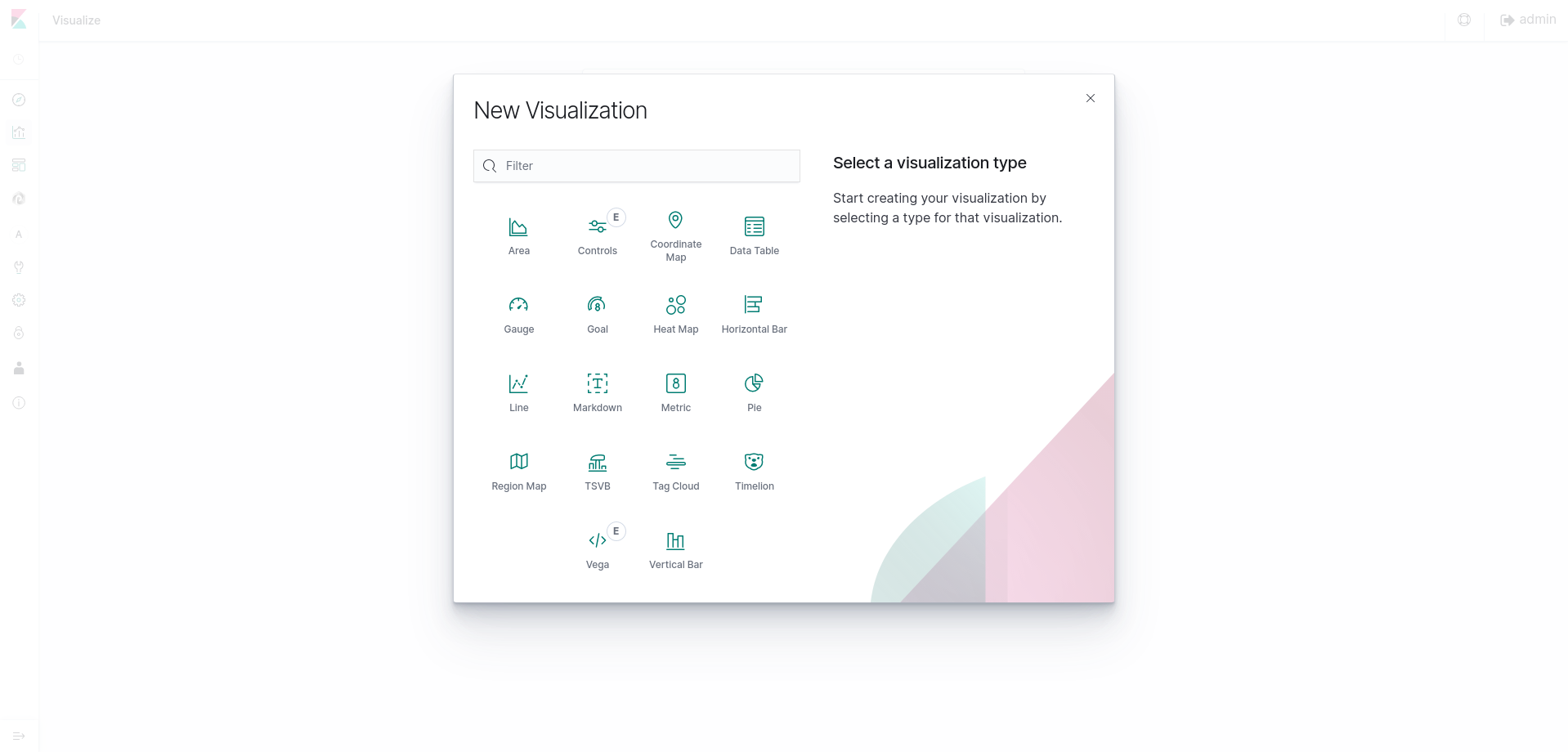
Several types of visualizations are available:
- Area chart
- Data table
- Line chart
- Markdown widget
- MetricPie chart
- Tile map
- Vertical bar chart
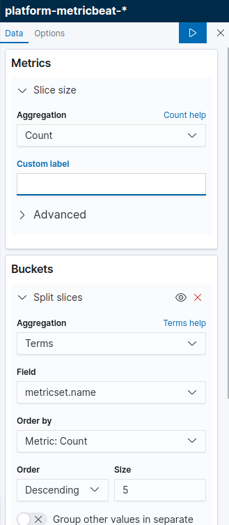
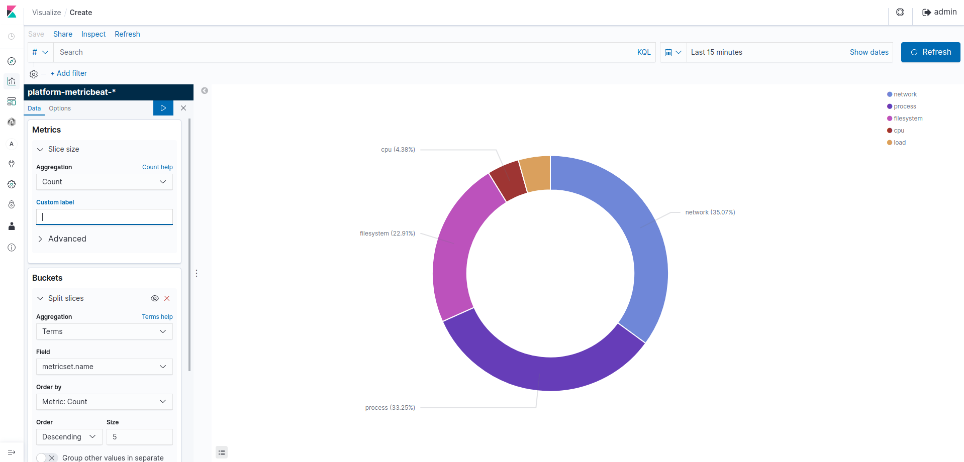
Click on Pie chart, then select your source (before add an index pattern).
Visualizations depend on Elasticsearch aggregations in two different types: bucket aggregations and metric aggregations. A bucket aggregation sorts your data according to criteria you specify. For example, in a upload volume data set, we can establish a range of uploader, then display what proportions of the total fall into which range of te highest uploader. The whole pie displays, since we haven't specified any buckets yet.
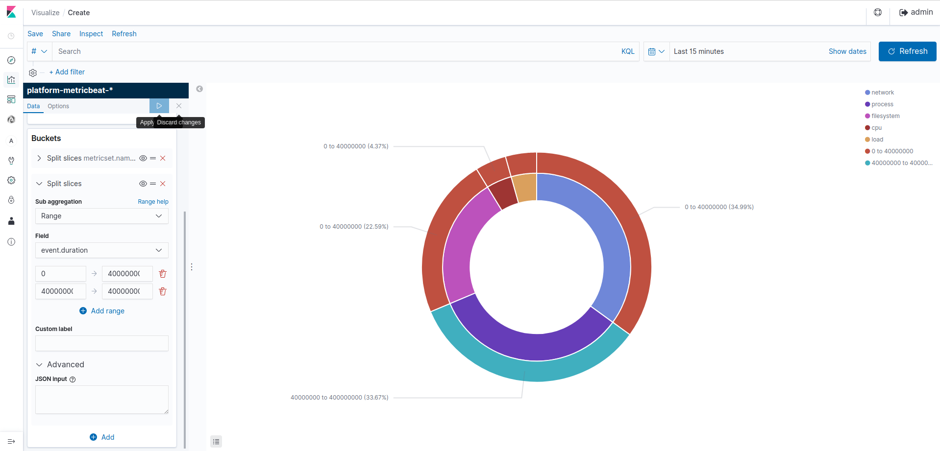
Select Split Slices from the Select buckets type list, then select Range from the Aggregation drop-down selector. Select one field (ex. session.in.byte) from the Field drop-down, then click on Add Range four times to bring the total number of ranges to six. Enter the following ranges:
This shows you what proportion amongst all your logs fall into the biggest uploads. To see another dimension of the data, we're going to add another bucket aggregation. We can break down each of the logs by selecting destinations : target.host.ip. Click Add sub-buckets at the bottom, then select the Terms aggregation and the field from the drop-downs. Click the green Apply changes button to add an external ring with the new results.
Add sub-buckets at the bottom, then select the Terms aggregation and the target.host.ip field from the drop-downs. Click the green Apply changes button to add an external ring with the new results.
Save this chart by clicking the Save Visualization button to the right of the search field. Name the visualization. Try out creating other fancy visualizations!
This following section is NOT about raw log extraction.
After creating some visualizations, you can extract aggregations from there. To export data to csv/excel from Kibana follow the following steps:
- Click on Visualize Tab & select a visualization (if created)ne de requête ou au format JSON,comme dans la barre de recher
- If not created create a visualization.
- Click on caret symbol (^) which is present at the bottom of the visualization.
Then you will get an option of as the bottom of the page.